


Mobile vs. Desktop: How to Create a Guest-First Experience
April 22, 2024
Written by

SHARE ON SOCIAL


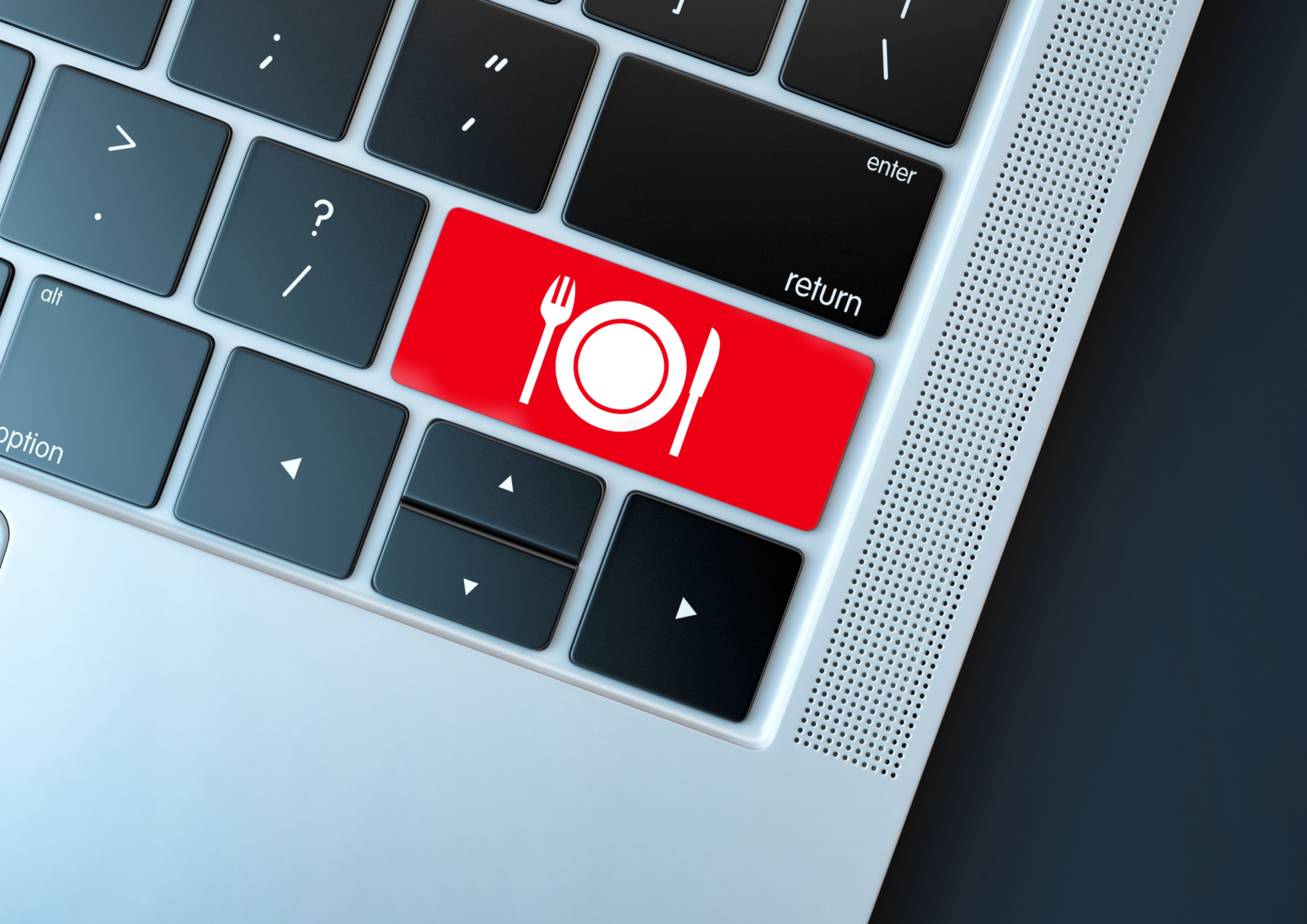
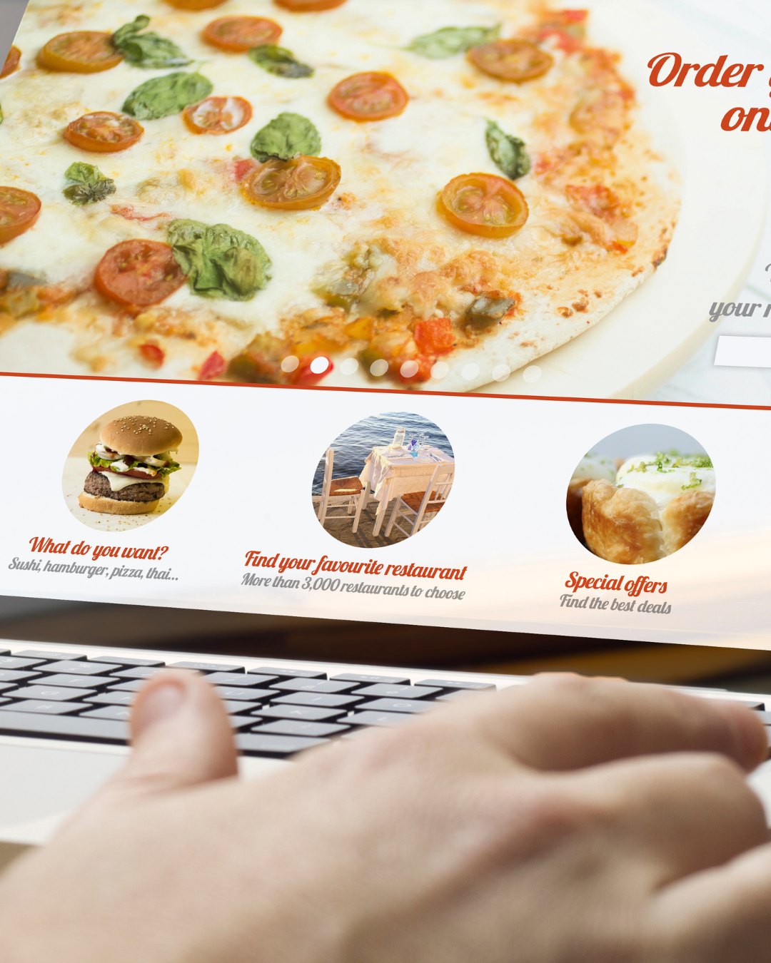
Within the fiercely competitive landscape of the restaurant industry, having an online presence is now considered a foundational building block of any food service business. As diners increasingly rely on digital platforms for exploring menus, making reservations, and placing takeout and delivery orders, understanding how diners interact with mobile and desktop versions of your website is vital for a guest-first experience. In this blog, we’ll dive into five key areas to analyze when designing a website for desktop and mobile that can help your brand determine the optimal platform for designing your website.
Convenience
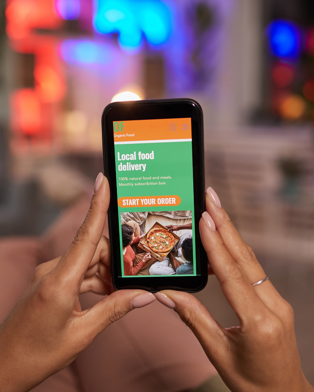
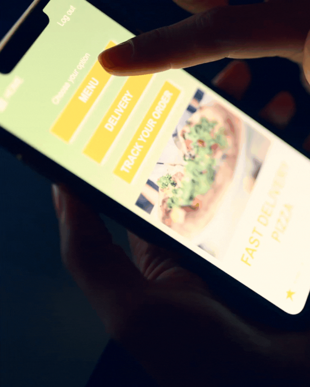
In the fast-paced world of dining, convenience reigns supreme. Mobile devices offer unparalleled accessibility, allowing hungry patrons to browse menus, check operating hours, and make reservations on-the-go.
Whether it’s a quick search for nearby eateries or placing a takeout order during a lunch break, mobile platforms provide seamless access to restaurant services. Prioritizing mobile optimization ensures that your restaurant always remains within arm’s reach of hungry customers.
Inmersion
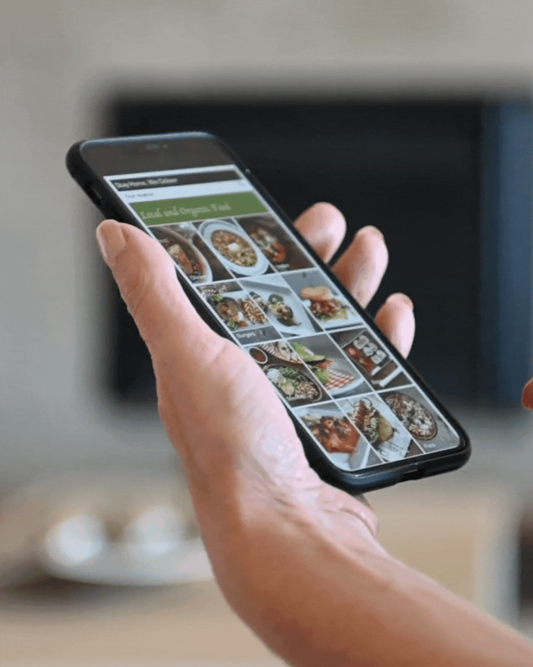
Creating immersive dining experiences is essential for enticing customers and fostering loyalty. While desktop computers offer ample screen space that can showcase vibrant imagery, detailed menus, and interactive features, mobile devices provide unique opportunities for enhancing immersion. Features like swipeable photo galleries, immersive videos, and augmented reality menus can captivate mobile users, elevating their dining experience to new heights. Balancing immersive elements across both platforms ensures that diners can experience your brand as intended, regardless of the device they use.
Efficiency
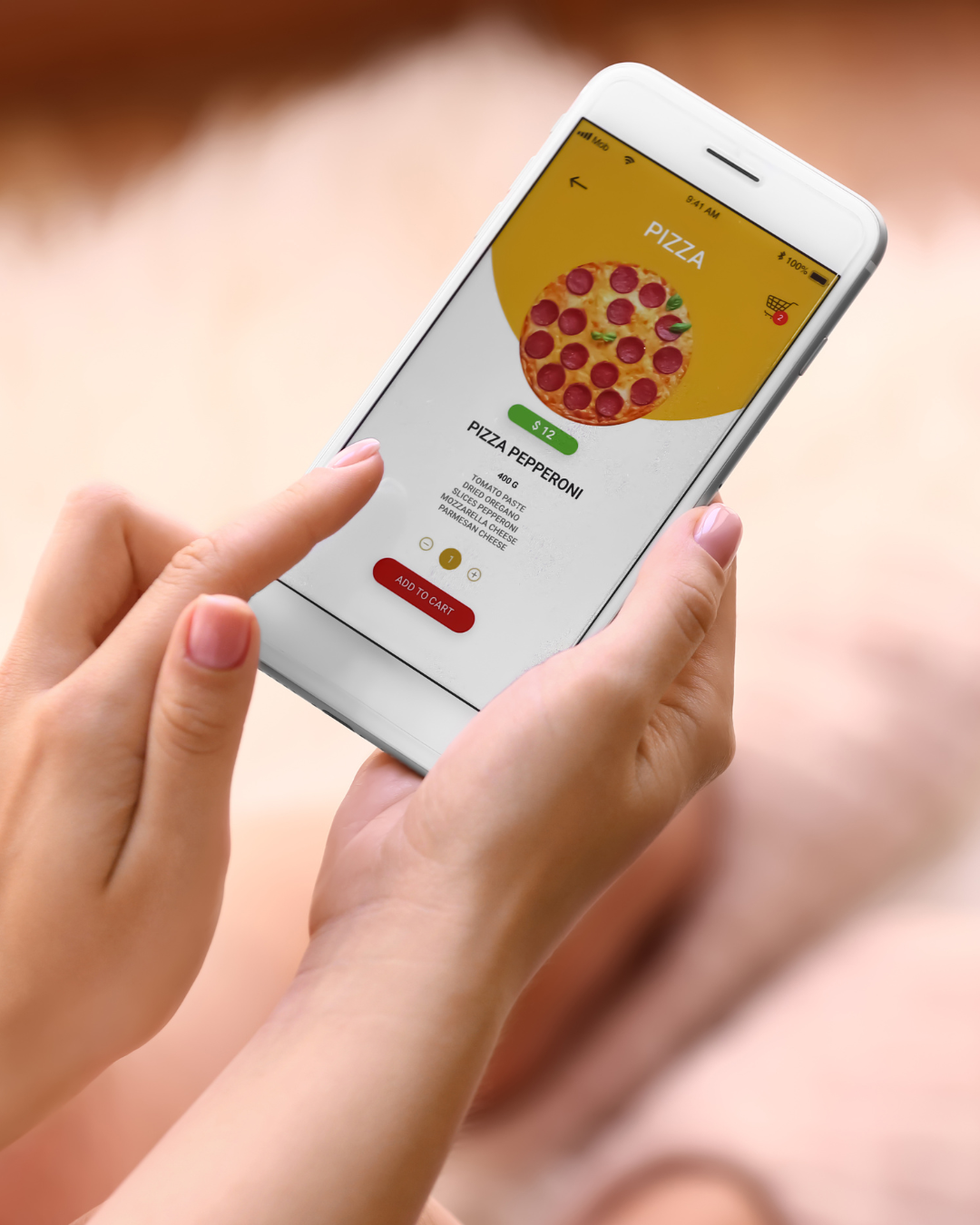
Efficiency is, and always will be, a priority in the restaurant industry, with timely service consistently bolstering customer satisfaction. Mobile platforms excel in streamlining the dining experience, allowing customers to view menus, place orders, and make reservations with just a few taps. Features like mobile payments, order tracking, and personalized recommendations enhance efficiency, reducing wait times and minimizing friction in the ordering process. Desktops, on the other hand, facilitate efficient online booking for large parties, catering orders, and event reservations. Optimizing both platforms ensures a seamless and efficient dining experience for all customers.
Multi-Tasking
The ability to multitask seamlessly is essential for busy diners juggling multiple responsibilities. Desktops provide the perfect platform for multitasking, allowing users to research restaurants, read reviews, and make reservations while simultaneously working or managing other tasks. However, mobile devices have become increasingly adept at supporting multitasking, with features like split-screen mode, quick app switching, and seamless integration with messaging apps. Prioritizing multi-tasking features ensures that customers can easily navigate your website while tending to other commitments.
Engagement
Engagement is the secret ingredient of successful restaurant websites, driving guest loyalty and repeat business. Mobile platforms excel at fostering spontaneous interactions, with features like push notifications, location-based offers, and social media integrations, keeping customers engaged and informed. Desktops, on the other hand, provide a conducive environment for in-depth engagement, with ample screen space for diving into menu descriptions, reading reviews, and planning special occasions. Balancing engagement across both platforms ensures that customers stay connected with your restaurant, whether they’re on-the-go or sitting down to research and plan their next big event.
In summary, the decision to prioritize either mobile or desktop platforms in restaurant website designs hinges on a multitude of factors. Mobile platforms offer unparalleled convenience and spontaneity for patrons on the move, whereas desktops afford immersive experiences and efficiency for comprehensive research and planning. By strategically optimizing your website for both platforms, you can establish a cohesive and compelling brand presence that accommodates the varied preferences of your guests in today’s contemporary digital landscape.

Tephie is a Marketing and Communications Specialist at 5&5 who thrives on crafting compelling stories and building connections through words. With a passion for the restaurant industry and creative problem-solving, she ensures every blog post resonates with readers while delivering actionable insights. She also plays a key role in creating and executing social media strategies that bring 5&5 to life. Outside of work, you’ll find Tephie brainstorming new ideas, exploring food trends, or adding fun energy to the team!

Leave a Reply